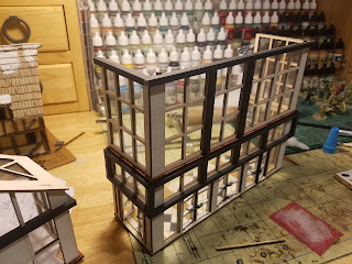
As I mentioned in the last post, I've been wanting to build something, anything, for quite a while now. So why not try something easy like the entrance to the 4Ground Twin Peaks Mall? Excuse the paper sign for now, a 3D printed sign is going to be an absolute must in the future.
For probably the last year and a half I have slowly been picking up kits from the Twin Peaks line. Taking full advantage of sales and discounts because they are definitely on the expensive side. All told I can safely say that everything that I've bought (which is the monster starter box in front, and then the two stacks immediately behind it) so far was at 40 to 50% off. Yeah, I know, madness lol!
I actually have a total of three entrances. Again, yeah, I know! But if you're building a mall, go big or go home I say - and why I have those two huge stacks of kits. Thinking that the entrance would be really simple was pretty dumb - mostly because I never make anything simple as you'll see below.
I'm not sure why the doors weren't painted in a metal color, so I did that myself.
I love 4Ground, but a few things that really bother me about their kits is the "flatness" of the buildings and a lot of the "sameyness".
While the kits to create this entrance definitely didn't suffer from any "sameyness", I did feel it definitely suffered from that "flatness" I mentioned.
I definitely think that something like this was needed, I only wonder if I should have used a smaller size. I'm thinking yes. And that I also need to add a few more pieces to the corners and ends.
What's nice is that for a post apocalypse setting, a lot of the burn marks on the parts that I usually have to clean up from the laser can be left to give a more distressed look. The above shows an example of a cleaned up piece (right side) compared to the untouched piece (left side). A huge difference.
I also put together one of the expansion roof and floor kits. The "glass" on all these kits is a real challenge - even being incredibly careful you're sure to get a few finger prints on them and it's super annoying for someone who has OCD!
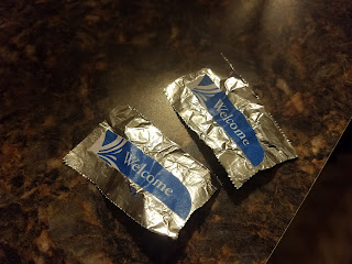
I added some "Welcome" signs to either side of the front doors. I found the signs online and resized them to fit in the space. I also glued them onto tin foil to give the an improved look.
A simple addition, but I think it makes a big improvement to the entrance.
Looking from the inside of the entrance.
I thought it would be fun to have product banners hanging from the rafters. Being a zombie apocalypse I figured that a skin care product sign would be hilarious. Searching online I found the perfect one and by using this cream, you too can look 10 years younger in just four weeks!
I added some thread to act as the wire to hold the sign. I think having a lot of different rafter signs will add a lot of fun tongue in cheek laughs to the layout.
One rabbit hole I did go down was actually painting the tiles on the floor. I think it's a night and day difference and I'm really happy with the end result, but oh my word!
And here are a few figures in the new entrance - and it shows why I'm all about this new thin clear base, the figures just blend right into the floor. I'm going to wait to do any kind of weathering because I'm not sure if I'm going to make this early days of the apocalypse or much later into it.
So a fun little start, but I don't see the mall being any kind of a focus. There are way too many things I need to sort out design and layout-wise. The biggest being the roof. I'll be totally honest here, I think 4ground really missed a huge opportunity here. The roof could have essentially been a whole other level for game play, but instead you've got a pitched roof. It's a real head scratcher for me. That absolutely has to change, and I'm not sure if I can do it. I totally redesigned the roof to 4Grounds warehouse kit here, but this is totally different. There are other issues too - all the stores are essentially "shoe boxes", where are my corner shops? Why there isn't a hallways expansion set has me shaking my head as well. And where is the movie plex??!! Oh well :)
Moving into October I've got some more Walking Dead figures lined up to finish.
Also a quick shout out to a couple of new followers - Stewart, Gerardo, Staz Matt - and I don't think I ever acknowledged Jason F, Millsy and Joe - thanks a lot for following guys, I really appreciate it!
Until next time, thanks for looking!
Ivor


Ivor at first I thought they were piles of pitza boxes, then realized they were buildings, you certainly have your work cut out.good job so far, the additions you've done make a difference.
ReplyDeleteThe painting of the floor is good but it's going to take an age to do all this, have you thought if printing sheets of tiles and just gluing them on?
Anyway good luck with this.
Ha! I can definitely see pizza boxes 🙂
DeleteI'll be honest John, printing tile sheets never even occurred to me?!?! That's a brilliant idea, cheers mate!
You could have photocopied the tile you painted so they all looked the same.
DeleteIndeed, something that will make the tile work much faster.
DeleteMy stack consists of one building and that scares me. Great job.
ReplyDeleteHa! I totally understand 🙂 My problem continues to be having zero self control when sales and discounts are announced, this will forever be my achilles heel.
DeleteMy studio's weep at the size of your's budget Ivor :( ;)
ReplyDeleteThe flatness of MDF is its only real problem as they can really get great detail on it, your additions are as always top notch mate.
Time spent painting the tiles imo was time well spent but I can see how yor be driven mad if you tried to do a lot of it so printed ones might be the way to go :)
Lol! It is a bit mad isn't it? If the production team could only catch up I'd feel a whole lot better 🙂
DeleteI will definitely look into printed tiles, that was a brilliant suggestion by John.
That was quite a stack of wood kits there! I thought my pile of 4 ground kits was big but that just put me to shame!
ReplyDeleteThe mall entrance looks great and all those extra touches really enhance the model and make it unique. Though you’re correct that you probably need a plan so that the project fits together as a whole.
Thanks for the shout out. I’m enjoying your blog. 😀
Much appreciated Stew! Adding little bits and bobs to the kits is definitely where I have the most fun when building.
DeleteAgreed that there will have to be a whole lot of pre-planning and mock layouts before I decide what to do with this monstrosity, so I don't see anything more happening on this
front for quite some time 🙂
Wow, that is some task you've set yourself and I shudder to shink of the cost, even at your dscounted rates.
ReplyDeleteYeah, I would be driving a much nicer car if it weren't for this darn hobby of mine 😀
DeleteComing along nicely dude!
ReplyDeleteCheers Simon!
DeleteWhat a building and a massive job for you. Nicely done so far though dude
ReplyDeleteCheers Andy! Much appreciated 🙂
DeleteIvor Evans - master modeller!!! Dang, you have caught the madness ... in all the right ways. Love the painted floor and other details. Makes a big difference. Awesome stuff man!!
ReplyDeleteThanks my friend! Really pleased with how the floor tiles came out. I may need your expertise on helping me with a 3D printed sign for the entrance though 😉
DeleteCripes Ivor, regardless of the flaws you've listed in the kits in general, you've done a bang up job assembling and adding the extra touches to bring a little more life. For the price 4Ground charges, you'd think these would be a bit more indepth.
ReplyDeleteI eye'd the Mall kits for a bit for my own Zombie project, but think I'll just stick with the plans I have. You seem to have bought all available boxes anyhow looking at those stacks! LOL
Much appreciated Dai! Agreed that I think 4Ground is missing that little added touch here and there to give the kits a bit more real world feel - though I do have to keep reminding myself over and over that this isn't an architecture model, but something to push miniatures around in. It is hard though!
DeleteLooking forward to seeing what you've got planned for your zombie project, hopefully we'll
see a bit of it this month 🙂
Wow! The adds you made to the kit knocked it out of the park! I love the coloured tile and planters. Rick and Carl are shopping in style.
ReplyDeleteMuch appreciated! I have to admit that the floor tiles and planters are easily my favorite parts of this build 🙂
DeleteReally jealous about this. I'd love to have one of those, I just don't have the space for it. I'll enjoy watching it come together.
ReplyDeleteCheers Kieron! I'm not sure if I've got the space for it to be honest 🤣
Delete