Apologies to everyone for the silence the last couple of months, I have been having major issues with my laptop and finally thought that I had it sorted a while ago but unfortunately did not - a new one looks like the realistic solution but the bank account says differently so we'll attempt to plug away using the mobile device 🤷♂️
I saw Dave Stone was having another hobby challenge with scenery so I decided to jump in and revisit some old 4Ground buildings of mine.
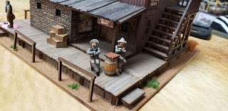
First up, I went back and re-worked the entire 4Ground Sheriff's Office.
I think that's what I love most about the 4Ground stuff, is that you've got a great kit to start but have that ability to enhance it if you want.
To be honest I'm not completely happy with the colour of the walls, so I'm sure that will be another re-visit in the future.
The roof and the overhang though I couldn't be happier with. I cut some old bass wood and stained them with some inks and I think I'll be trying this out on a couple other buildings as well.
Knuckleduster have a really neat office set for your town sheriff so I painted that up to add a bit of fun to the interiors.
I've talked about this before, as we really begin to edge towards making a "dollhouse" with these types of additions, but for me I'm all about the little details and that's really what I think brings a table/game to life.


Oh, that's absolutely amazing!
ReplyDeleteMuch appreciated Michal!
DeleteYou have elevated the whole kit Ivor, the additional furniture adds character to the rooms without occupying too much gaming space, and your scenic shots look like stills from a movie, fantastic work all round mate
ReplyDeleteCheers Dave! I took the lot up to the club for a game so was able to get a couple of good photos because of better lighting - my hobby studio is in a finished attic and the ceilings are only 6 feet high, so the canned lights create awful shadows on my tables, which is incredibly frustrating 😫
DeleteI happen to think the wall colour looks just fine mate.
ReplyDeleteBut overall, I think this building looks far better than the stock version. Your town must be a wealthy one to be able to afford such a large Sheriff's office!
Thanks Dai! There's still just something missing to my eye on the colour, maybe more highlights 🤷♂️
DeleteI think it has more to do with the large number of criminals in the area lol! We're going to have to start locking people up on the second floor too 🤣
That is if those brigands don't get shot prior to their arrests! Your games are rather bloody afterall! :)
DeleteToo true, I've been getting quite a lot of use out of my casualty figures lately 😀
DeleteWow, stunning work and you've really taken that building way above what it could have been. The exterior looks amazing but the interior work is just excellent, the details are superb.
ReplyDeleteThanks a lot Matt, much appreciated! This one was a lot of fun to go back and re-visit 🙂
DeleteLovely work Ivor! So this is what you've been up too! I think that maybe trying to rub a wet used teabag over the interior walls may do the trick...though I suggest trying it on a spare piece first if you have any. I am like you in my enjoyment of the details to make a game pop!
ReplyDeleteCheers Terry! I've actually been doing a fair bit of hobbying but the laptop issues have really made it difficult to post - it's so much easier to edit posts on the laptop.
DeleteThat's a really good idea with the teabag, I will definitely give that a go 👍
Some really nice improvements to the building. It looks GORGEOUS. almost like a dolls house, but in a cool wargame way. 😀
ReplyDeleteLol! Much appreciated Stew!
DeleteWhat a transformation from a good building to an outstanding one. All the detailing was well worth the effort s it brings the new look to a whole new level.
ReplyDeleteCheers Joe! Appreciate the kind words 😀
DeleteDAMN!!!!! That looks SOOOOOOOOOOOOOOOO much better than the stock model - great work Ivor!
ReplyDeleteThanks a lot Jay!
Delete